
“Border” – Solo Exhibition by Gyuhan Lee at the Korean Cultural Center in Sweden: Artist Talk
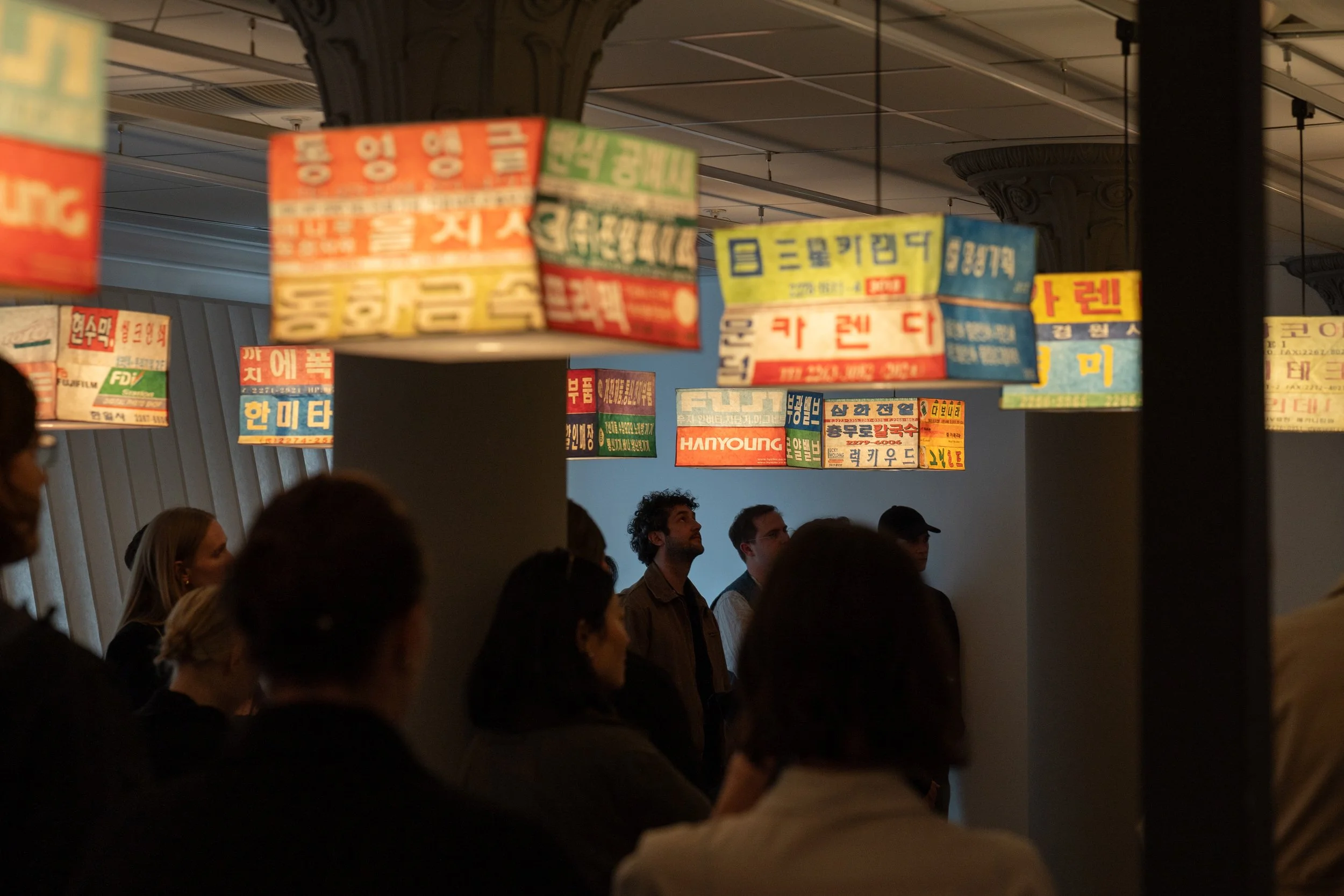
Photo Credit: Korean Cultural Center in Sweden
Soon after moving to Stockholm, a dear friend introduced me to the Korean Cultural Center (KCC). Inspired by the many cultural events held at the center – and missing Korea terribly, who am I kidding? – I asked whether there would be any opportunity for me to support upcoming exhibitions. Serendipitously, a few weeks later, I was welcomed to help out with Border, a solo exhibition by artist Gyuhan Lee, whose collaboration with Gucci I often reference during my guest lectures on luxury artification in the Korean context. When I was asked to lead the artist talk for the VIP pre-opening, I knew I had to record it and share it with a wider audience.
The exhibition was held in collaboration with Stockholm Stad for Kulturnatt Stockholm (Stockholm Culture Night) 2026. This gave me the chance to help prepare cultural experiences for the public to enjoy a taste of Korean culture, making the event even more memorable and meaningful for me.
In collaboration with the KCC, I have also prepared a guided tour of the exhibition, which runs through 30 June and is open for public registration via Eventbrite.
Thank you again to the Korean Cultural Center for granting me this honor, to artist Gyuhan Lee for being so open to discussing his art, and to everyone involved in the project – especially architect Frida Sandberg and designer Jonatan Salomonsson, who designed and created the exhibition space, and graphic designers Jiwon Shin (project leader at KCC) and Jingyu Lee. You truly made it a transformative experience.
The session was held in English and Korean, so I've prepared both versions, featuring Korean transcription by Seungjin Lee and editing by Soyeon Kim. Before we jump into it, below is the artist’s profile from Side Gallery:
“Gyuhan Lee (1996, Seoul) began his formation at Kaywon University of Art and Design, where he specialised in Living Design, questioning the role of the waste that everyday actions carry with them, a question that will give rise to interesting design proposals, where he has forged a personal line.
His first series "On My Seat" transformed Nike boxes into pieces of furniture, intermingling mass production, the waste of the product of which he was a consumer, in pieces close to craftsmanship, where accumulation gave rise to new forms of furniture, putting comfort, utility and consumism in the spotlight. The design of the new pieces was also questioned from an aesthetic point of view, rethinking dynamism through the use of the symbol, as a pattern that would end up setting a rhythm, both chromatically and formally, when intertwined in the final design.
This can be seen again in the design of lamps, which were recognised with the 2015 Red Dot Design Award. His work has been featured in relevant design media such as Wallpaper Magazine and Design Milk.”
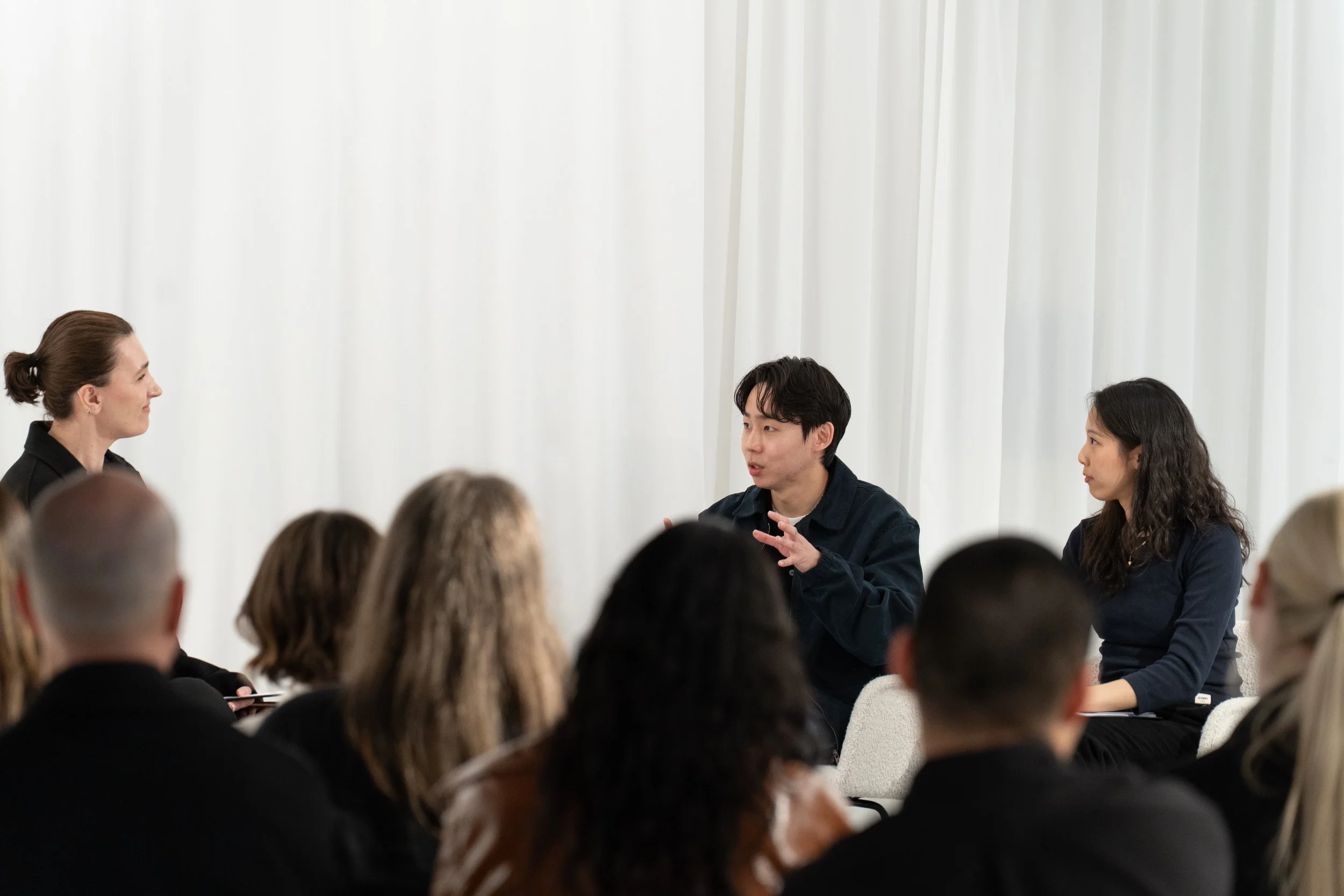
Photo Credit: Korean Cultural Center in Sweden
DKL: Your work transforms disposable, mass-produced packaging into high-finish furniture and sculpture. As you repurpose materials, how do you go about selecting and transforming them? Do you find yourself consuming with the intention of creating? How do you decide what to discard and what to keep for future projects?
Gyuhan Lee: First of all, I tend to keep everything around me instead of throwing things away. I collect everything first, and later some of it becomes material and some of it doesn’t.
The main criterion for choosing materials is that they are things closest to my everyday life – brands that I actually consume myself.
For example, when I worked with Nike boxes, I was going through the mock-up stage of making miniatures before building furniture pieces. Then one day I looked at the pile of Nike shoe boxes stacked in my room and thought, “It would be interesting to use these as materials,” and that’s how it started. McDonald's was also something I naturally chose because it was part of my everyday consumption during the COVID period.
If there is one clear criterion, it’s that the brand has to carry a certain symbolic quality. Beyond simply being famous products, I mainly choose brands that have become a common language around the world.
Each brand holds memories for me personally, but also contains individual narratives for the public as well. For example, when I was in middle school, there was a McDonald’s in front of my school, so I used to go there during breaks or on weekends. I think most people probably have at least one memory connected to those brands in their own way. What I find really interesting is that viewers can look at my work through their own memories and interpret the brands from their own perspective.
DKL: 대량 생산되고 쉽게 버려지는 포장재를 고급 가구와 조각 작품으로 변형시키는 작업이 인상적입니다. 재료를 재활용하고 변형하는 과정에서 어떤 기준으로 소재를 선택하시나요? 창작을 염두에 두고 소비를 하게 되는 경우도 있나요? 또 어떤 것은 버리고 어떤 것은 이후 작업을 위해 남겨둘지 어떻게 결정하시나요?
이규한 작가: 우선 저는 제 주변에 있는 것들을 버리지 않고 다 모아두는 편이에요. 일단 다 모아두었다가 나중에 재료가 되기도 하고 안 되기도 하거든요.재료를 고르는 기준은 제 일상에서 가장 가깝고, 제가 실제로 소비하는 브랜드 위주예요.
예를 들어 나이키 박스로 작업했을 때는 가구를 만들기 전에 미니어처를 만드는 ‘목업(mock-up)’ 단계를 거치고 있었는데요. 문득 제 방에 쌓여있는 나이키 신발 박스들을 보고 ‘이걸 재료로 삼아 만들면 재미있겠다’는 생각이 들어서 시작하게 됐어요. 맥도날드 역시 코로나 시기에 제가 일상적으로 소비하면서 자연스럽게 선택하게 된 경우고요.한 가지 명확한 기준이 있다면 그 브랜드가 ‘상징성’을 가져야 한다는 점이에요. 단순히 유명한 제품을 넘어 전 세계 공통의 언어가 된 브랜드를 주로 고릅니다.
브랜드마다 제가 가진 기억도 있지만, 대중 각자만의 서사도 담겨 있거든요. 예를 들어 저는 중학교 때 학교 앞에 맥도날드가 있어서 쉬는 시간이나 주말마다 가곤 했는데, 다른 분들도 저마다 그 브랜드에 얽힌 추억이 하나쯤은 있을 거라 생각해요. 관객들이 각자의 기억을 바탕으로 제 작업을 바라보고 브랜드를 해석할 수 있다는 점이 정말 재미있습니다.
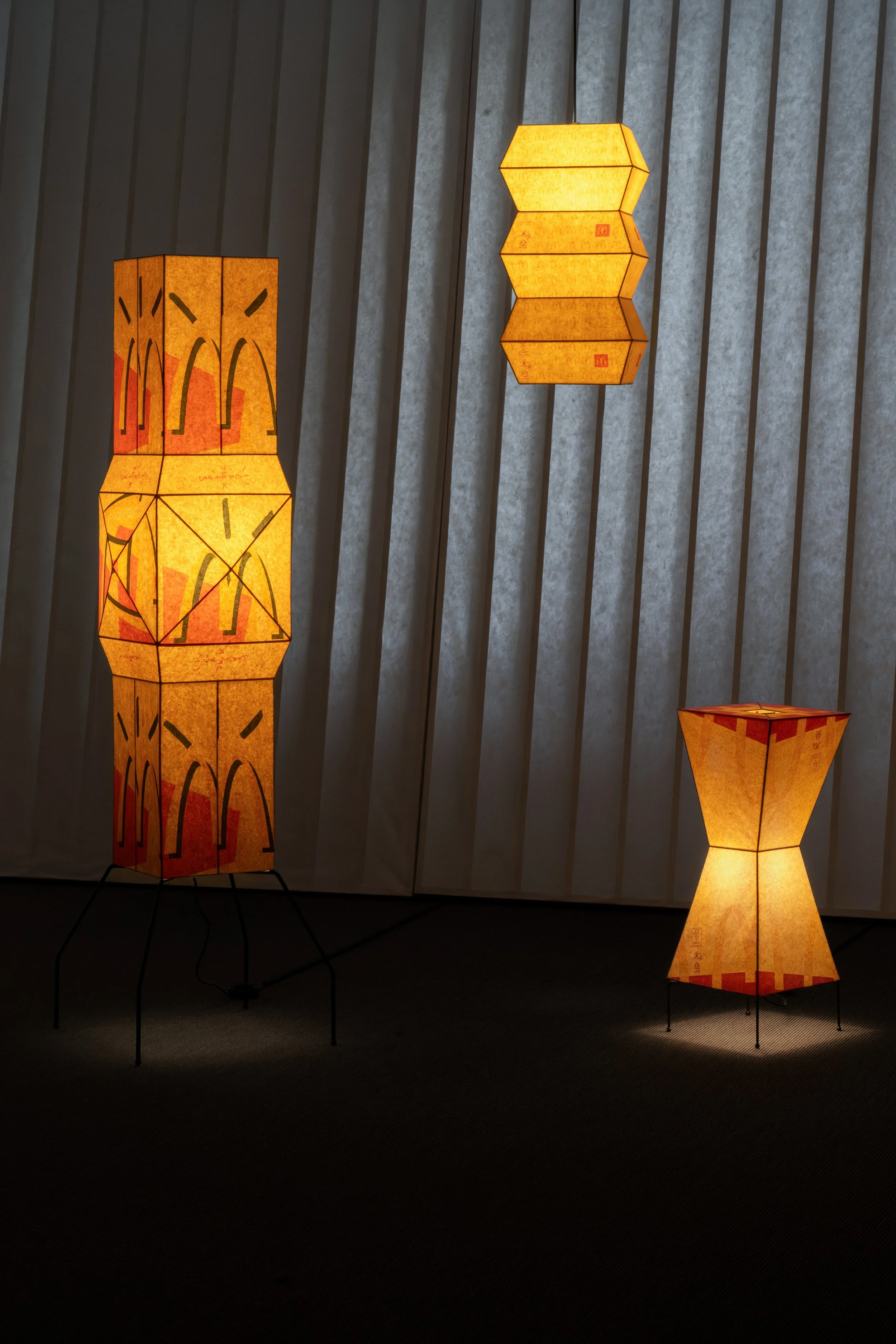
Photo Credit: Korean Cultural Center in Sweden
DKL: You frequently reference luxury brands (Hermès, Prada, collaboration with Gucci) alongside fast-food wrappers and distinctly functional brands (Nike). Is there a philosophy in how you choose the brand, and do you feel a tension between the more mass market and luxury references?
Gyuhan Lee: I don’t really place much distinction between McDonald's and luxury brands because I approach them simply as materials.
For example, one of my works is a lighting piece made from Hermès oil paper. During a trip to Tokyo, I came across the Hermès Building in Ginza. It was designed by Renzo Piano, my favorite architect, and I was so deeply inspired by it that I wanted to create my own version of the Hermès building. I wanted to use paper materials from Hermès, and when I looked into it, the branded tissue paper cost around 50,000 won [approx. 30 USD]. I think it’s probably the cheapest paper product sold by Hermès. I used that material and added craft-based techniques such as hand-dyeing to create my Hermès work.
A work I made using Prada packaging came about in a similar way. A few years ago, when I visited Milan, I saw the gold-leaf-covered building at the Fondazione Prada and got the idea to create an Euljiro [을지로, district in Seoul] version of the Prada building.
In this way, my works come from inspiration I directly experienced and felt myself, rather than from any conscious engagement with the grand narratives or values associated with the brands. Whether it’s Hermès or Prada, they are ultimately the results of ideas I encountered firsthand through the perspective of a traveler or observer.
DKL: 작품에서는 에르메스, 프라다, 협업을 진행했던 구찌 같은 럭셔리 브랜드와 함께 맥도날드 포장지나 나이키처럼 보다 기능적이고 대중적인 브랜드가 자주 등장합니다. 브랜드를 선택하는 데 있어 일관된 철학이 있으신가요? 또한 대중성과 럭셔리 사이의 긴장감에 대해 어떻게 생각하시는지도 궁금합니다.
이규한 작가: 저는 맥도날드든 럭셔리 브랜드든 그저 하나의 ‘재료’로 접근하기 때문에, 둘 사이에 큰 차이를 두지는 않아요.
예를 들어 제 작업 중에 에르메스 기름종이로 만든 조명이 있는데요.도쿄 여행 중에 긴자에 있는 에르메스 빌딩을 보게 됐어요. 제가 가장 좋아하는 건축가인 렌조 피아노가 설계한 건물인데, 거기서 깊은 영감을 받아 저만의 버전으로 에르메스 빌딩을 만들고 싶어졌죠. 에르메스의 종이 재료를 활용하고 싶어서 찾아보니 기름종이가 5만 원 정도 하더라고요. 에르메스에서 가장 저렴한 종이 제품일 것 같아요. 그걸 가져와서 핸드 다잉(hand-dyeing) 같은 공예적 기법을 더해 만든 게 제 에르메스 작업입니다.
프라다 패키징을 이용한 작업도 비슷해요. 몇 년 전에 밀라노에 갔을 때 프라다 파운데이션의 금박 건물을 보고 아이디어를 얻어, 을지로 버전의 프라다 건물을 만든 적이 있거든요. 이처럼 제 경험 속에서 직접 보고 느낀 영감으로 작업한 것이지, 브랜드가 가진 거창한 서사나 가치를 의식하면서 만든 건 아니에요. 에르메스든 프라다든, 제가 여행자나 관찰자의 시선으로 직접 마주하고 얻은 아이디어의 결과물인 셈이죠.
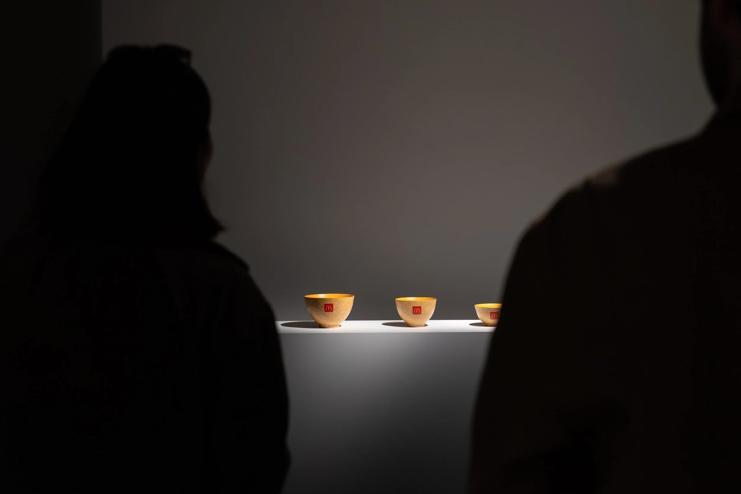
Photo Credit: Korean Cultural Center in Sweden
DKL: Seoul is a city defined by rapid development and a high turnover of goods. While Koreans are extremely well-versed in Western brands and the artwork feels very grounded in Korean urban culture, I find the possibilities of “localizing” your art and engaging with new audiences fascinating e.g., the IKEA receipt-covered glass. Do you see your language resonate equally well in Korea and abroad, or are there nuances to it?
Gyuhan Lee: I don’t create my work with a specific audience in mind beforehand, so I don’t really approach domestic and international audiences differently. This may be a slightly different point, but the reason I use hanji in my work or incorporate Korean historical and traditional elements is because I’m Korean. Compared to materials from other countries, I can easily access high-quality hanji [Korean mulberry paper], and above all, I can naturally find opportunities to collaborate with artisans who make things like the turtle ship [거북선, geobukseon; turtle ships participated in the war against Japanese naval forces in the XVI century], gosa ritual [고사; a traditional Korean ritual ceremony performed to pray for good fortune, safety, prosperity, or success], and Korean masks. I think that’s why I tend to actively incorporate those distinctly Korean images into my work.
In the end, it all comes back to the idea of “balance,” which I’ve mentioned throughout. If McDonald's represents the West, then the way I work is based on very Eastern techniques. By combining those two contrasting elements, I’m continuously trying to create my own balance.
DKL: During one of our conversations, you mentioned that in the case of McDonald’s, you did notice a very different response to the brand in the US.
Gyuhan Lee: That’s right. For people in East Asia like me or my Japanese friends, McDonald's is actually a place where you can get relatively good-quality hamburgers. Our parents’ generation also bought McDonald’s for us quite often.
But in large American cities like New York or Los Angeles, I’ve heard that parents try not to expose their children to the McDonald’s logo or brand at all. In the United States, it has such a strong image as junk food and as an unhealthy brand that the perspective toward it is completely different.
In fact, there was once a collector who was a parent and really wanted to buy one of my McDonald’s lighting works, but ultimately couldn’t purchase it because they felt they couldn’t keep it in the house for educational reasons related to their child. As an artist, that was a bit unfortunate.
DKL: 서울은 빠른 개발과 높은 소비 순환 속도로 정의되는 도시라고 생각합니다. 한국 사람들은 서구 브랜드에 매우 익숙하고, 작품 역시 한국 도시 문화에 깊이 기반하고 있다는 느낌을 받았습니다. 동시에 이케아 영수증으로 덮인 유리 작업처럼, 작가님의 작업 언어가 새로운 관객과 지역 안에서 어떻게 “현지화”될 수 있는지도 굉장히 흥미롭게 느껴졌습니다. 작가님의 시각 언어는 한국과 해외에서 동일하게 공명한다고 느끼시나요? 혹은 서로 다른 맥락과 뉘앙스가 존재한다고 생각하시나요?
이규한 작가: 저는 특정 관객을 미리 염두에 두고 작업하진 않기 때문에, 국내외 관객에 따라 접근 방식을 다르게 하지는 않아요. 조금 다른 이야기일 수 있지만, 제 작업에 한지를 사용하거나 한국의 역사적이고 전통적인 요소를 녹여내는 건 제가 한국인이기 때문이에요. 다른 나라 재료보다 퀄리티 좋은 한지를 쉽게 구할 수 있고, 무엇보다 거북선, 고사, 한국 탈 등을 만드시는 장인분들과 협업할 기회를 자연스럽게 얻을 수 있으니까요. 그래서 그런 한국적인 이미지를 더 적극적으로 차용하게 되는 것 같아요.
결국 앞서 계속 말씀드렸던 ‘균형’에 관한 이야기인데요. 맥도날드가 서구를 대표하는 브랜드라면, 제가 작업하는 방식은 매우 동양적인 테크닉이거든요. 그 이질적인 두 요소를 결합하면서 저만의 균형을 계속 맞춰나가는 중입니다.
DKL: 이전 대화 중에, 특히 맥도날드의 경우 미국에서는 브랜드에 대한 반응이 매우 다르다는 점을 느꼈다고 말씀하신 적이 있습니다.
이규한 작가: 맞아요. 저나 일본 친구들처럼 동양권 사람들에게 맥도날드는 꽤 괜찮은 퀄리티의 햄버거를 먹을 수 있는 곳이거든요. 실제로 저희 부모님 세대도 저희에게 맥도날드를 자주 사주셨고요. 그런데 뉴욕이나 LA 같은 미국 대도시에서는 부모들이 아이들에게 맥도날드 로고나 브랜드를 절대 노출하지 않으려고 한다더라고요. 미국에서는 워낙 정크푸드라는 인식이 강하고, 건강에 안 좋은 브랜드라는 이미지가 세서 바라보는 시선 자체가 완전히 다른 거죠. 실제로 어떤 부모 컬렉터 분은 제 맥도날드 조명 작품을 정말 사고 싶어 하셨는데, 아이 교육상 집에 둘 수가 없다며 결국 구매를 못 하신 적도 있었어요. 작가로서는 좀 아쉬웠죠.
Photo Credit: Korean Cultural Center in Sweden
Photo Credit: Korean Cultural Center in Sweden
DKL: You said that you started working on the McDonald’s series during COVID as you found yourself surrounded with takeout packaging. The series spans a wide range of objects, from paper lanterns to the gosa ritual – how did you decide on the format? The contrast and tension between the branded paper vs the often very traditional functionality is quite fascinating and multi-layered.
Gyuhan Lee: My first work was a somewhat heavy, sculptural chair-like piece made using Nike shoe boxes. The next series used McDonald's paper bags. Of course, I could have made the same kind of heavy chair using McDonald’s bags as well. But I kept thinking about what form could present the material of the bag itself in the most compelling way.
Then I found a clue in my surroundings. My studio is near Dongguk University, which is a Buddhist university. Because of that, it was easy to see discarded traditional Korean hanji lanterns around the area, and that’s how I naturally arrived at the idea of lighting.
Whenever I choose materials, I think I’m always searching for the form in which the material can appear most attractive once transformed into something else. Sometimes that becomes a McDonald’s lighting piece, and other times, like in my turtle ship works, it appears in the form of reinterpreting ice cream sticks as the oars of a ship. In this way, I’m always trying to preserve and reveal the inherent appeal of the material itself.
DKL: 맥도날드 시리즈를 코로나 시기에 주변에 쌓여가는 테이크아웃 포장재를 보며 시작하셨다고 말씀하셨어요. 이 시리즈는 램프부터 고사상에 이르기까지 매우 다양한 형태를 포함하고 있는데, 각각의 형식을 어떻게 결정하게 되셨나요? 브랜드가 인쇄된 종이와 전통적인 기능성을 가진 오브제 사이의 대비와 긴장감이 굉장히 흥미롭고 다층적으로 느껴집니다.
이규한 작가: 제 첫 작업은 나이키 신발 상자를 활용한, 다소 묵직한 조각 형태의 의자 같은 작업이었어요. 그다음 시리즈가 맥도날드 종이봉투였는데, 물론 맥도날드 봉투로도 똑같이 무거운 의자를 만들 수도 있었겠죠. 하지만 저는 그 봉투라는 재료 자체를 가장 매력적으로 보여줄 수 있는 형태가 무엇일까 계속 고민했어요. 그러다 주변 환경에서 힌트를 얻게 되었는데요. 제 작업실이 동국대학교 근처에 있는데, 거기가 불교 학교거든요. 그래서 주변에 버려진 한국식 한지 랜턴을 쉽게 볼 수 있었고, 거기서 자연스럽게 조명이라는 아이디어를 얻은 거죠.
저는 항상 재료를 고를 때, '이 재료를 다른 무언가로 바꿨을 때 가장 매력적으로 보일 수 있는 형태가 뭘까' 고민하며 작업을 찾는 것 같아요. 그게 맥도날드 조명이 되기도 하고, 거북선 작업처럼 아이스크림 막대를 배의 노(櫓)로 재해석하는 방식으로 발현되기도 합니다. 이처럼 저는 항상 재료가 가진 본연의 매력을 그대로 보여주려고 노력해요.
Photo Credit: Korean Cultural Center in Sweden
DKL: Your work blurs the line between industrial design, fine art, and traditional craft. How do you yourself define your art? What do you think of the contrast between the maintained functionality and the brand expression embedded into the artwork? How do your collectors approach your art?
Gyuhan Lee: I studied furniture design, so at first I made chairs, and now I work mainly in the form of lighting pieces. But in fact, I’m interested in a wide range of fields, from Piet Mondrian to Andy Warhol.
That’s why, rather than placing my work into a specific category like design or fine art, I simply call it “work,” and I introduce myself as someone who works. I don’t really want to define my practice as any one thing. The title of this exhibition, Border, also carries the meaning of a “boundary line” in addition to the meaning of a national border.
In a way, I think my work stands right on the boundary between all of those things. So I often describe my work as “a really well-made, delicious juice.” That’s truly what I hope my work can be.
DKL: 작가님의 작업은 산업디자인, 순수미술, 그리고 전통 공예의 경계를 흐리는 것처럼 보입니다. 작가님 스스로는 자신의 작업을 어떻게 정의하시나요? 기능성이 유지된 상태에서 브랜드의 상징성과 표현이 작품 안에 스며드는 대비에 대해서는 어떻게 생각하시나요? 또한 컬렉터들은 작가님의 작품을 어떤 방식으로 받아들이고 접근하나요?
이규한 작가: 제가 가구 디자인을 전공해서 처음에는 의자를 만들었고 지금은 조명 형태의 작업을 하고 있지만, 사실 몬드리안이나 앤디 워홀처럼 굉장히 다양한 분야에 관심이 많아요. 그래서 저는 제 작업을 디자인이나 파인 아트 같은 특정 카테고리로 묶기보다, 그냥 '작업'이라고 부르고 저 스스로를 '작업자'라고 소개하곤 합니다. 제 작업을 굳이 어느 하나로 정의 내리고 싶지 않거든요. 이번 전시 타이틀인 《보더(Border)》도 국경이라는 뜻 외에 '경계선'이라는 의미를 담고 있어요.
어떻게 보면 제 작업이 딱 그 모든 것들의 경계선 위에 서 있는 것 같아요. 그래서 저는 제 작업을 '되게 잘 만들어진 맛있는 주스'라고 항상 표현하곤 하는데요. 제 작업이 정말 그랬으면 하는 바람이 있습니다.
Photo Credit: Korean Cultural Center in Sweden
DKL: The Seoul Signs series which depicts Chungmuro, Euljiro, and Jongno [충무로, 을지로, 종로 – districts in central Seoul] transports me directly into my favorite parts of Seoul, raw and unedited. This is the Korea I experienced when I first arrived in Seoul in 2008, but there is less and less of it in the metropolitan area. How did the series come to be and what was the intent behind it?
Gyuhan Lee: The illuminated signs you see on the third floor are not actually logos of specific brands. Rather, like my earlier works, this series began as I kept walking around the area near my studio and, from the perspective of an observer, started archiving things one by one.
Because those kinds of buildings and shops are gradually disappearing. As the city undergoes redevelopment, I felt a sense of regret about it, and since there are actually businesses there that I commission work from, I think of it as a very important neighborhood to me. But because of urbanization, a lot of it is disappearing, and I wanted to document it.
In fact, in today’s world, everyone talks about social media and AI. But that neighborhood still lives in a very analog way, with a kind of “what’s that?” attitude. I found that aspect really interesting.
DKL: ‘서울의 간판’ 시리즈는 충무로, 을지로, 종로를 담고 있으며, 제가 가장 좋아하는 서울의 풍경 속으로 곧바로 들어간 듯한 느낌을 줍니다. 거칠고 편집되지 않은, 제가 2008년에 처음 서울에 왔을 때 경험했던 한국의 모습이 떠오르지만, 이제는 수도권에서 점점 사라져가고 있는 풍경이기도 합니다. 이 시리즈는 어떻게 시작되었고, 그 안에 담고자 한 의도는 무엇이었나요?
이규한 작가: 저기 보이는 3층의 간판 조명들은 사실 특정 브랜드의 로고는 아니에요. 다만 앞선 작업들과 마찬가지로, 제 작업실 주변을 계속 돌아다니며 관찰자의 시선으로 하나씩 아카이빙을 하다가 시작하게 된 시리즈입니다.
왜냐하면 저런 건물들이나 가게들이 점점 사라지고 있거든요. 도시가 재건축되면서 한편으론 되게 아쉬운 마음이 들었고, 저기 실제로 제가 작업을 의뢰하는 업체도 있어서 저한테는 굉장히 중요한 동네라고 생각을 해요. 근데 도시화 때문에 많이 없어지고 있어서 저걸 기록하고 싶었어요. 사실 지금 SNS도 그렇고 이 시대는 온통 AI를 말하고 있잖아요. 그런데 그 동네만큼은 '그게 뭐야?'라는 뉘앙스로 되게 아날로그틱하게 살아가고 있거든요. 그 점이 너무 재미있었어요.
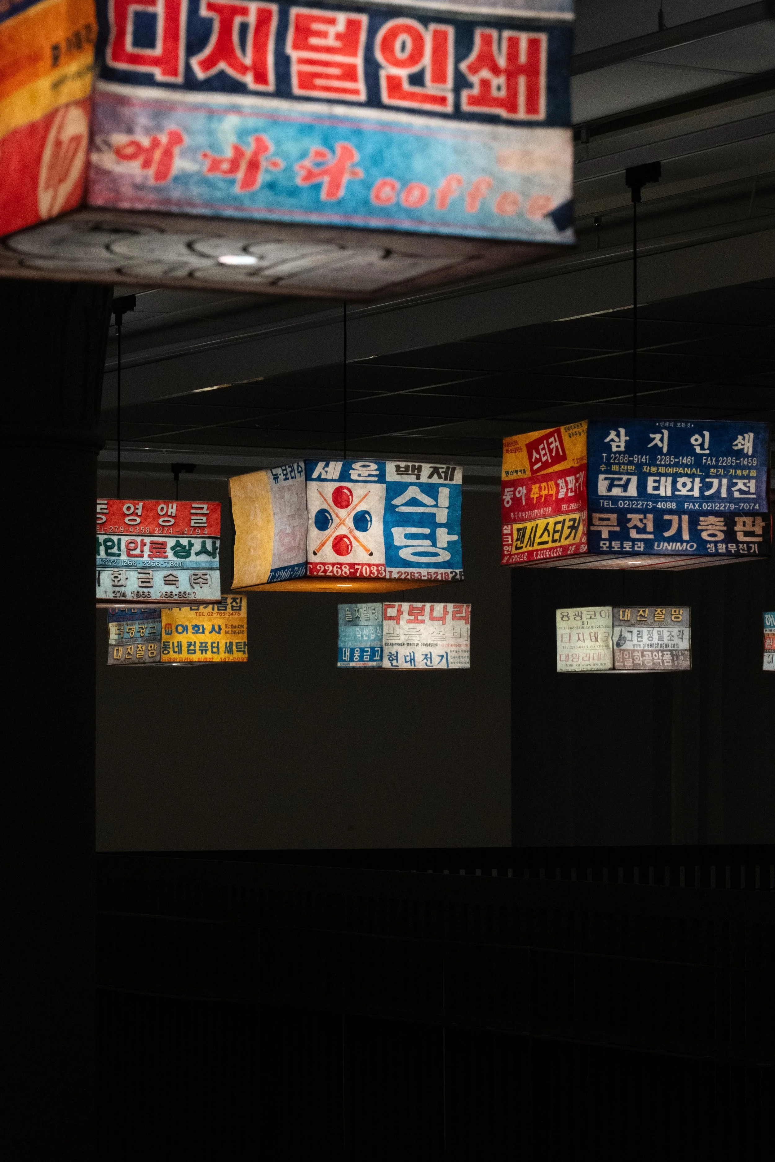
Photo Credit: Korean Cultural Center in Sweden
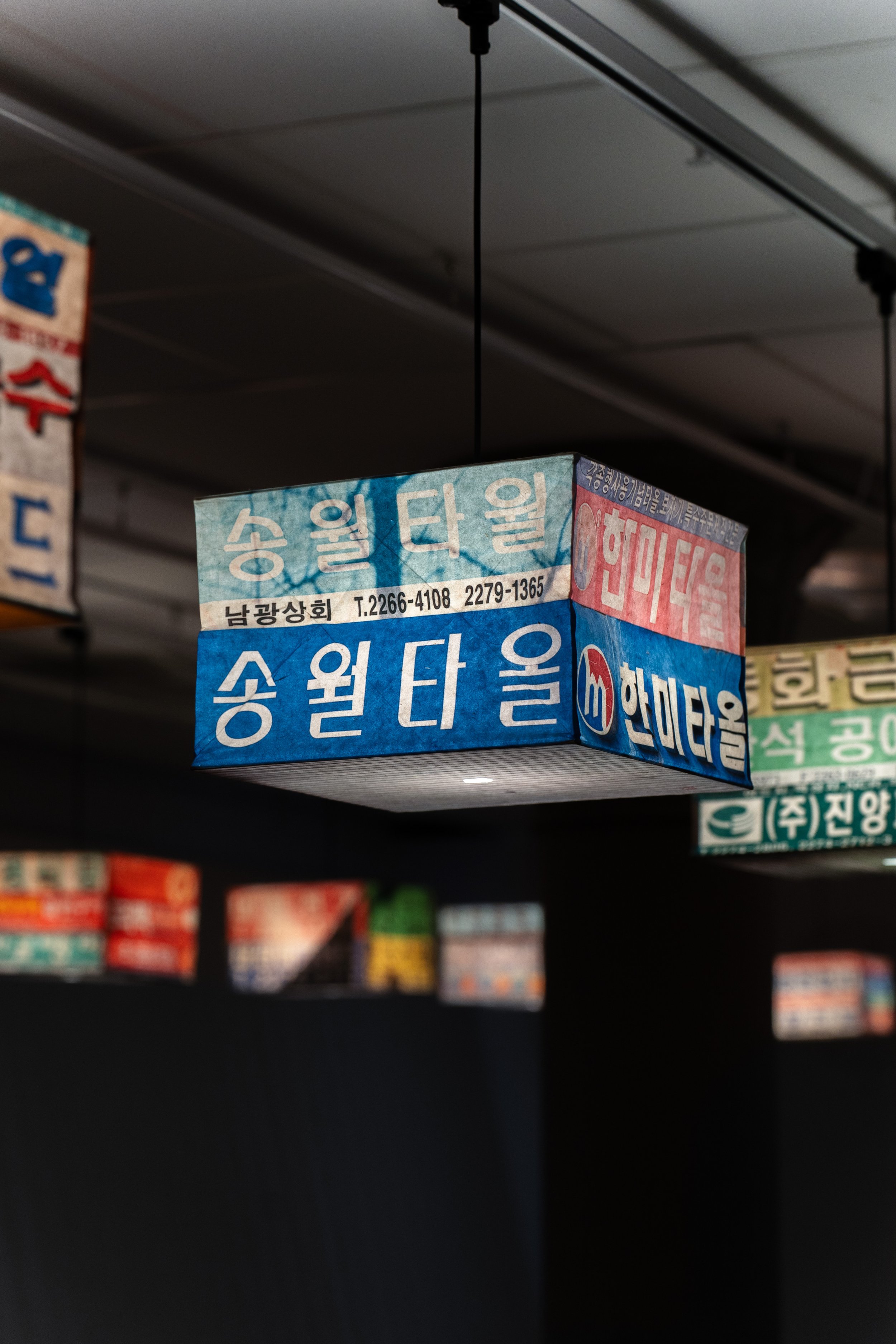
Photo Credit: Korean Cultural Center in Sweden
Q&A Session
Audience Member 1: Do you source the McDonald’s paper directly from printing shops?
Gyuhan Lee: No, all the materials used in my work are actual consumer products produced by those brands. There are also legal issues involved, so if I were to separately print and use those logos, it would be completely illegal.
If a brand had negative intentions and told me to stop using them, I might actually have to stop. But fortunately, the brands have viewed my work positively, and I’ve been able to carry out official collaborations with McDonald's.
All of my materials are, in a sense, “readymades.” The sign series is also made by photographing existing, real signs and using them. And the earlier Bowser head [main antagonist of Nintendo's Mario franchise] and Häagen-Dazs pieces were also made by directly taking existing packaging paper as it is and working with it.
Q&A 세션
관객 1: 맥도날드지를 인쇄소에서 직접 구해서 사용하시나요?
이규한 작가: 아, 아니요. 제 작업에 쓰이는 모든 재료는 전부 그 브랜드에서 실제로 생산된 소비재예요. 법적인 문제도 얽혀 있어서, 제가 만약 저 로고들을 따로 인쇄해서 쓰면 그건 엄청난 불법이 되거든요. 만약 브랜드 측에서 안 좋은 의도를 품고 "더 이상 쓰지 말라"고 하면 사실 멈춰야 할 수도 있는 부분인데, 다행히 브랜드들이 좋게 봐주신 덕분에 맥도날드와도 공식 협업을 진행할 수 있었죠. 제 작업의 모든 재료는 일종의 '레디메이드(ready-made)'인 셈이에요. 간판 시리즈도 실제로 존재하는 간판들을 직접 사진 찍어서 활용한 거고, 아까 보신 쿠파 머리나 하겐다즈도 다 진짜로 존재하던 패키지 종이를 그대로 가져와서 작업한 것입니다.
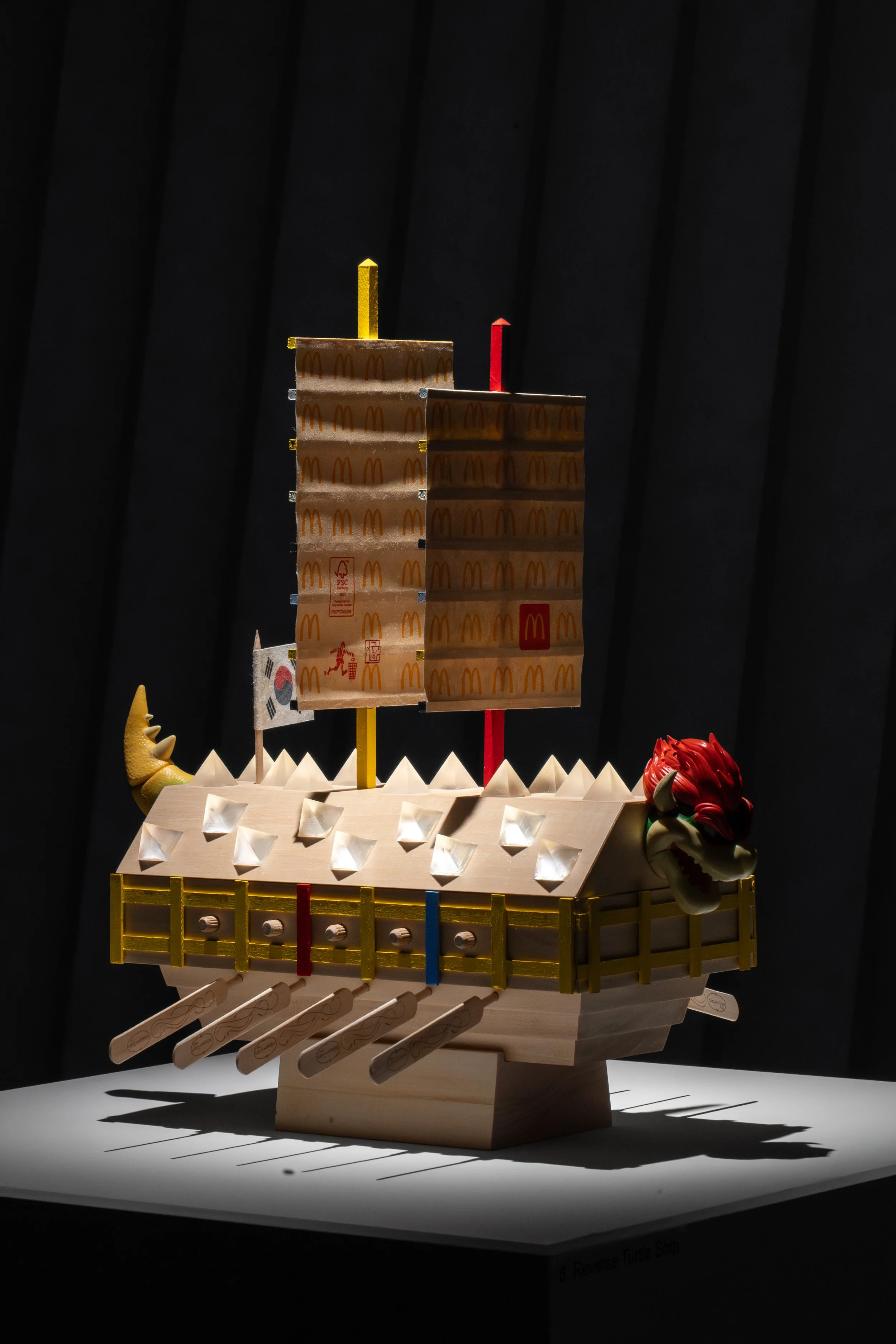
Photo Credit: Korean Cultural Center in Sweden
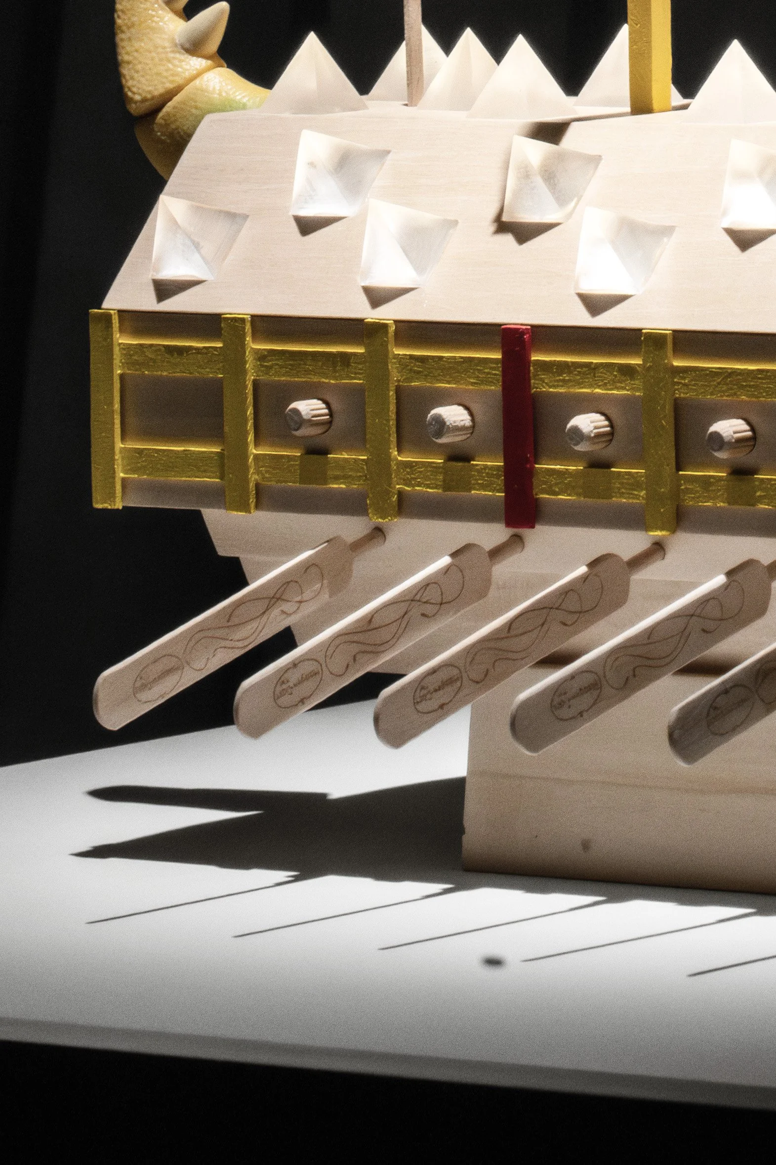
Photo Credit: Korean Cultural Center in Sweden
Audience Member 2: Have you always worked with interiors as a medium for your work?
Gyuhan Lee: Until now, I have mainly worked on interior-related projects. Then last year, I spent three months in a residency with two other artists. During that time, I also experimented with creating outdoor installations using manhole covers.
관객2: 작업의 매체로서 인테리어를 항상 활용해 오셨나요?
이규한 작가: 지금까지는 실내 인테리어에 관련된 작업을 주로 해왔어요. 그러다 작년에 3개월 동안 작가 세 명이서 레지던시 생활을 한 적이 있었거든요. 그때 마찬가지로 하수구 커버를 가지고 야외 설치물을 만들어 보기도 했었어요.

Photo Credit: Korean Cultural Center in Sweden
Audience Member 3: Is this exhibition commissioned by the Korea Culture Center or is it a traveling exhibition?
Gyuhan Lee: This exhibition was commissioned by the Korean Cultural Center, an institution that plays a role in introducing Korean culture. Therefore, for this space, I included elements that represent Korean culture, such as signboards, the turtle ship, and gosa ritual.
관객 3: 이 전시는 한국문화원에서 의뢰한 것인가요, 아니면 순회 전시인가요?
이규한 작가: 이 전시는 한국문화원에서 의뢰한 것으로, 한국문화원은 한국 문화를 소개하는 역할을 하는 기관입니다. 따라서 이 공간을 위해 간판, 거북선, 고사와 같은 한국 문화를 대표하는 요소들을 담았습니다.
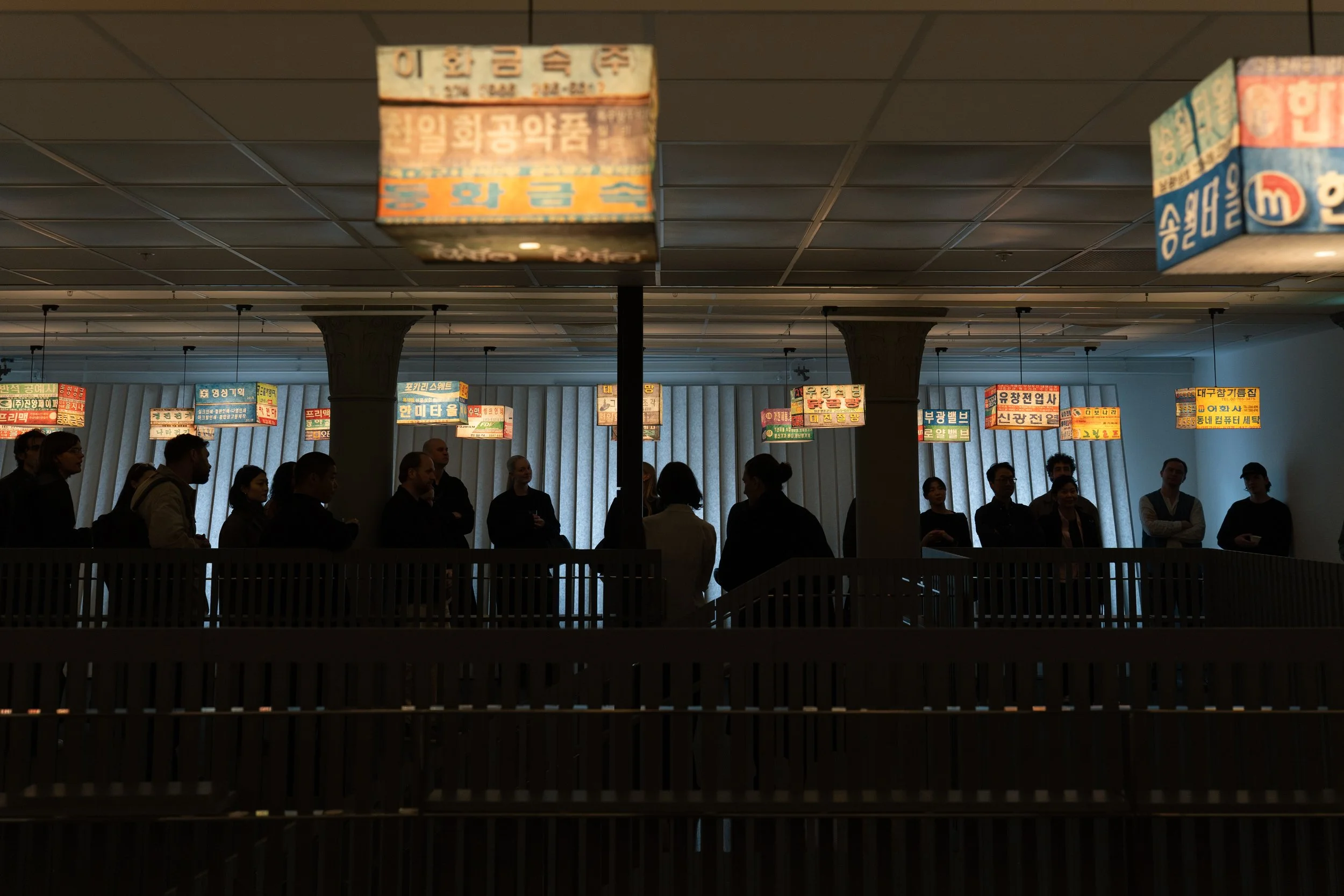
Photo Credit: Korean Cultural Center in Sweden
Audience Member 4: I don't know how much you have experienced Sweden, Swedishness in Stockholm, but I'm curious to hear, did you get any inspiration from Sweden and Stockholm to bring to maybe the next exhibition?
Gyuhan Lee: I wanted to, but I was completely immersed in the installation work for the exhibition, so I didn’t have time to look around the city.
DKL: But when we were preparing the space, we did keep one of the IKEA bags.
Gyuhan Lee: Maybe not as a direct source of inspiration but being here feels very peaceful. Seoul is very crowded and everything moves very fast. Stockholm feels very, very peaceful.
Audience Member 4: In your work, there is also lots of light.
Gyuhan Lee: Yes.
Audience Member 4: What does light mean and symbolize?
Gyuhan Lee: In fact, I believe that artistic practice – whether painting, sculpture, or video – should be able to interact with the audience. Among them, I think “light” is a particularly compelling device because it can communicate with the viewer more quickly and directly. So I intentionally use light quite extensively in my work.
관객4: 작가님께서 스웨덴이나 스톡홀름, 그리고 스웨덴적인 요소를 얼마나 경험하셨는지는 잘 모르겠지만, 스웨덴과 스톡홀름에서 받은 영감을 다음 전시에 가져올 계획이 있으신지 궁금합니다.
이규한 작가: 그러고 싶었지만, 전시 설치 작업에 완전히 몰두해 있어서 도시를 둘러볼 시간이 없었습니다.
DKL: 하지만 공간을 준비할 때, 이케아 가방 하나는 따로 보관해 두었습니다.
이규한 작가: 직접적인 영감이라고 하기는 어렵지만, 이곳에 있으니 굉장히 평화롭게 느껴집니다. 서울은 매우 붐비고 모든 것이 아주 빠르게 돌아갑니다. 스톡홀름은 정말, 정말 평화로운 도시입니다.
관객 4: 작가님의 작품에는 빛이 많이 사용되어 있는 것 같습니다.
이규한: 네.
관객 4: 빛은 어떤 의미를 가지며 무엇을 상징하나요?
이규한 작가: 사실 제가 생각하는 예술 작업은 그림이든 조각이든 영상이든, 관객과 상호작용을 할 수 있어야 한다고 보거든요. 그중에서도 '빛'은 좀 더 빠르고 직접적으로 관객과 소통할 수 있는 매력적인 장치 같아요. 그래서 좀 더 의도적으로 작업에 빛을 많이 활용하고 있습니다.
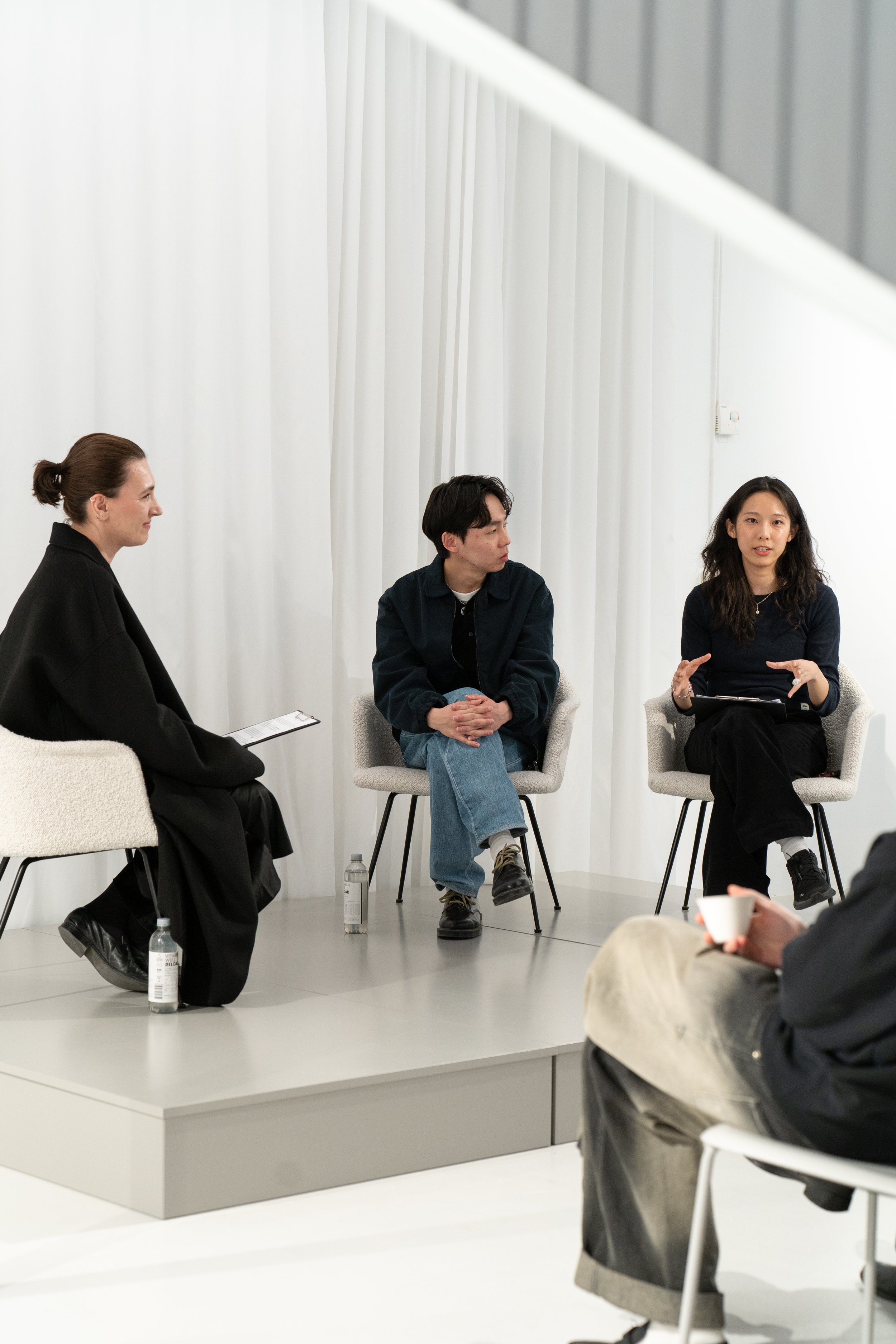
Photo Credit: Korean Cultural Center in Sweden
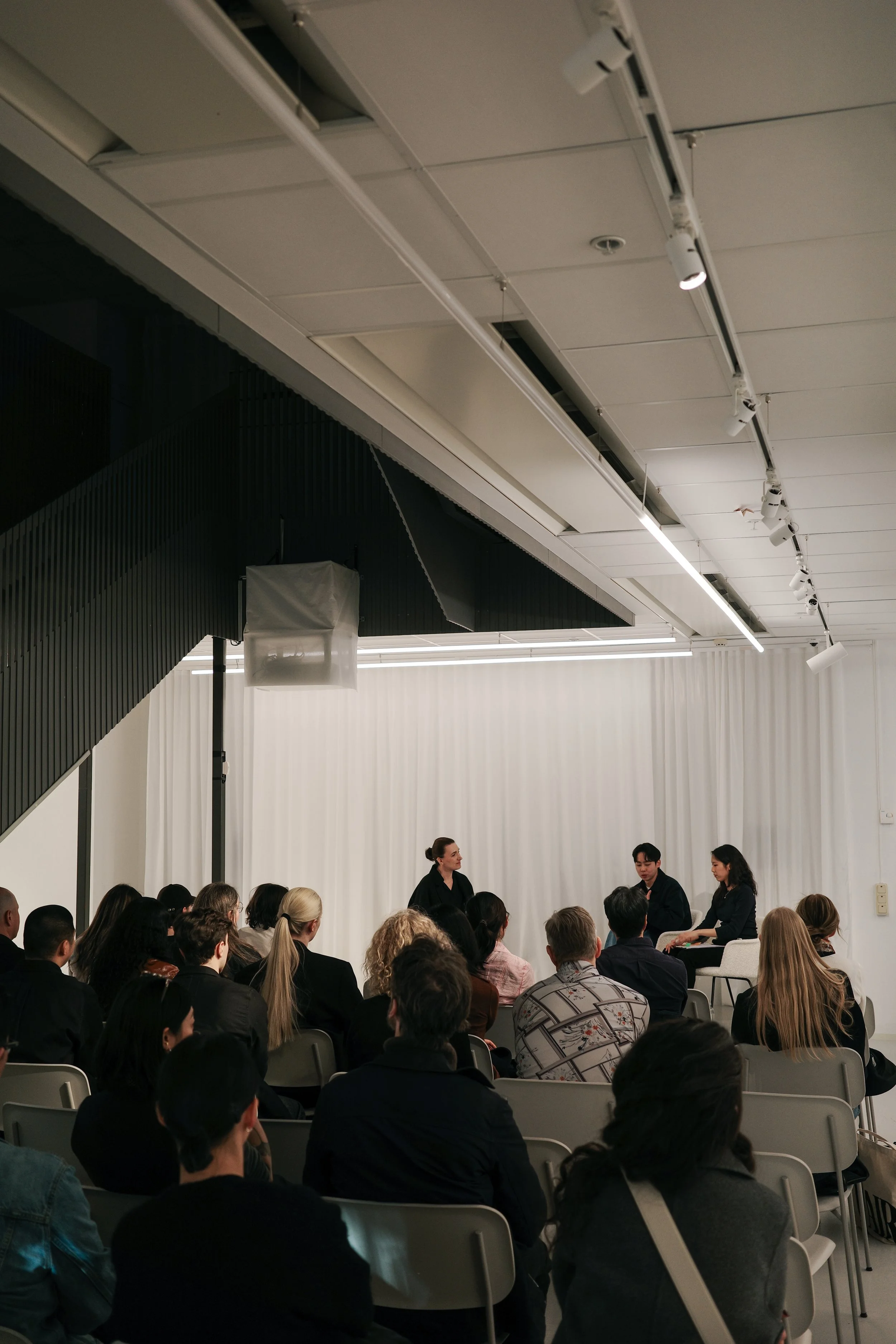
Photo Credit: Korean Cultural Center in Sweden
Audience Member 5: When I look at your use of recycled materials, it feels like sustainability might be a starting point in your practice. I’m curious about your future direction – do you prefer to develop your work in a way that more directly addresses or communicates sustainability, for example through functional outcomes like lighting or other practical applications, or are you more focused on interaction through exhibitions and installations?
Gyuhan Lee: More on the latter, I think. I want to be very honest about this part. My work may have some degree of connection to sustainability, but I think fundamentally it’s a completely different story.
These days, a lot of people talk about “sustainability” on the surface, but when you look closely, there are so many cases where that’s not actually true.
My work is closer to representing contemporary consumption patterns and culture than to sustainability. In fact, sometimes I even buy large amounts of McDonald's meals because I need the materials (like paper bags). I then donate all the food to the Korea Child Fund and only take the bags.
In the end, I am also still consuming new plastic or paper, so I don’t think I can really say that my work is centered on environmental sustainability.
관객 5: 재사용 재료를 사용하시는 걸 보면 지속가능성이 작업의 출발점처럼 느껴지기도 하는데요, 앞으로 작업 방향에서는 지속가능성을 더 직접적으로 이야기하는 쪽을 선호하시는지, 아니면 전시를 통한 인터랙션에 더 집중하시는지 궁금합니다.
이규한 작가: 후자에 더 가까운 것 같아요. 이 부분은 정말 솔직하게 말씀드리고 싶어요. 제 작업이 지속 가능성과 어느 정도 닿아 있는 면은 있겠지만, 본질적으로는 전혀 다른 이야기라고 생각하거든요. 요즘 보면 겉으로는 '지속 가능성'을 외치지만 정작 들여다보면 그렇지 않은 경우가 너무 많잖아요.
제 작업은 지속 가능성보다는, 현대의 소비 패턴과 문화를 대변하는 작업에 가깝습니다. 실제로 어떨 때는 재료(종이 쇼핑백 등)가 필요해서 맥도날드 세트를 대량으로 구매하기도 해요. 대신 음식은 한국어린이재단에 모두 기부하고 봉투만 가져오죠. 결국 저 역시 플라스틱이나 종이를 새로 소비하고 있는 셈이니, 환경적인 지속 가능성을 중심에 두고 작업한다고 하기는 어려울 것 같아요.
Korean language transcription by Seungjin Lee, edited by Seungjin Lee and Soyeon Kim
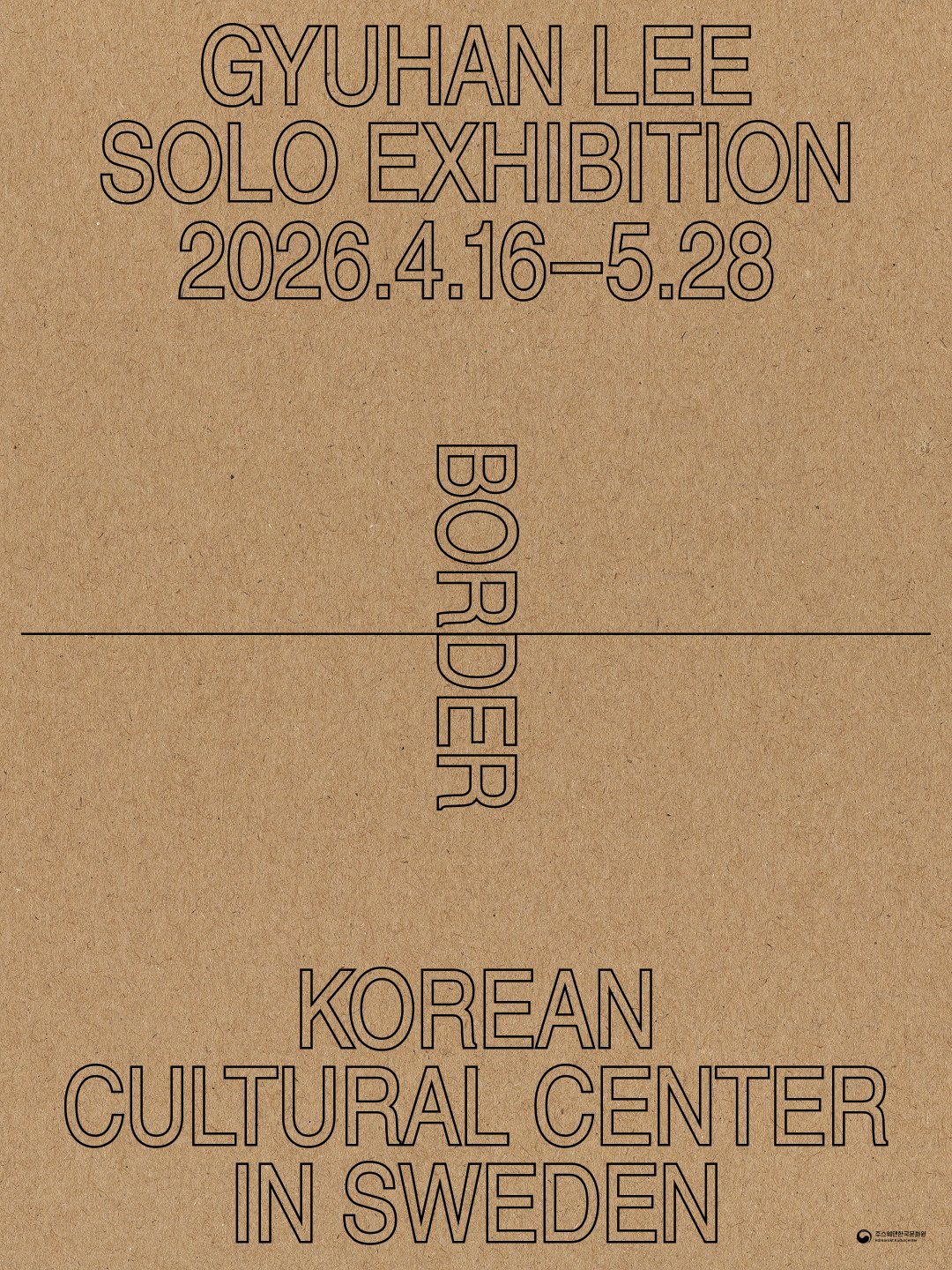
Official poster for Border: A Solo Exhibition by Gyuhan Lee, part of 2026 Kulturnatt Stockholm | Poster by @rundmann.works
P.S.
Fun was had.
Photo Credit: Korean Cultural Center in Sweden | Video Credit: Jonatan Salomonsson